
10 Reasons Your Scrim Banner Isn't Getting Noticed (And How to Fix It)
- Janet Emma
- Mar 4
- 5 min read

Your scrim banner is up. Traffic passes by. Nobody stops. Nobody calls. Nobody visits.
This happens more often than local business owners realize. A scrim vinyl banner represents an investment. That investment should generate visibility, foot traffic, and revenue. When it fails to perform, the problem usually falls into one of ten categories.
Here is what goes wrong with scrim banners. Here is how to fix each issue.
Why Scrim Vinyl Banners Work for Local Businesses
Before addressing the problems, understand why scrim vinyl remains a solid choice for outdoor signage.
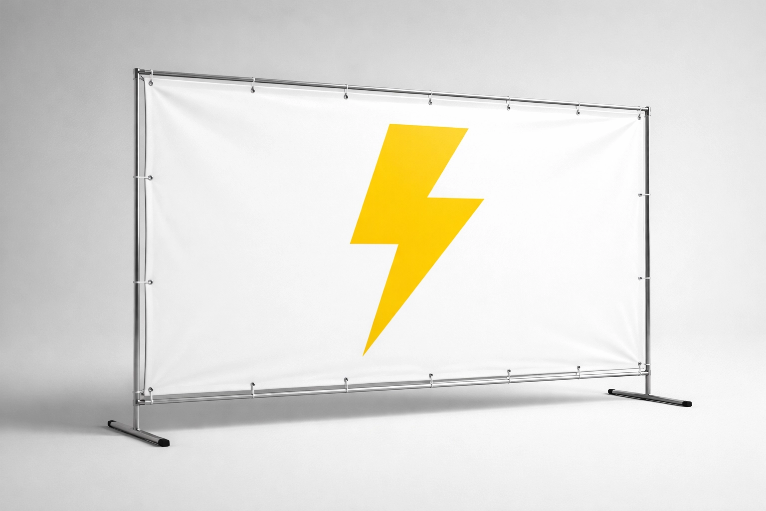
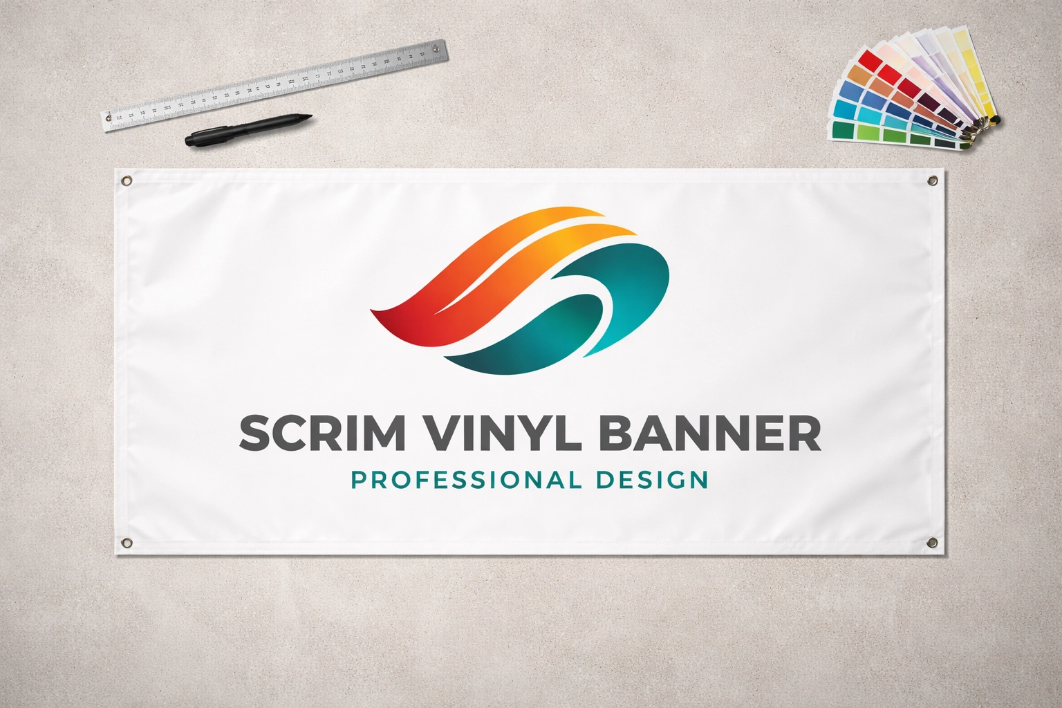
Scrim vinyl banners consist of vinyl material reinforced with a woven fabric mesh. This construction provides:
Durability against tearing and weather damage
Affordability compared to rigid signage options
Versatility for temporary or semi-permanent installations
Print quality that holds vibrant colors
Local businesses use scrim banners for grand openings, sales events, directional signage, and general brand awareness. The material handles outdoor conditions while remaining cost-effective for businesses watching their marketing budgets.
The material works. The design and placement determine results.
Reason 1: Your Design Is Too Complex
The Problem: Passersby have seconds to absorb your message. Overloading your scrim banner with excessive information, graphics, and text creates confusion. The viewer moves on before understanding what you offer.
The Fix: Focus on one primary purpose. One message. One call to action. Your scrim vinyl banner speaks to people in motion: drivers, pedestrians, cyclists. They cannot stop to read detailed content.
Remove secondary information. Keep the core message.
Reason 2: Your Text Is Too Small
The Problem: Text that cannot be read from a distance serves no purpose. Without proper sizing, viewers pass your scrim banner without reading a single word.
The Fix: Apply the standard rule: 1 inch of text height per 10 feet of viewing distance. A banner meant to be read from 100 feet away requires 10-inch tall letters at minimum.
Test readability. Stand at the actual viewing distance. If you squint, increase the size.
Reason 3: You've Chosen an Unreadable Font
The Problem: Decorative and stylized fonts look attractive on a screen. They become illegible on a scrim banner viewed from 50 feet away at 35 miles per hour.
The Fix: Select clear, simple fonts. Sans-serif options like Arial, Helvetica, or Impact remain readable at distance. Save decorative fonts for business cards and websites.
Legibility outranks style on outdoor signage.
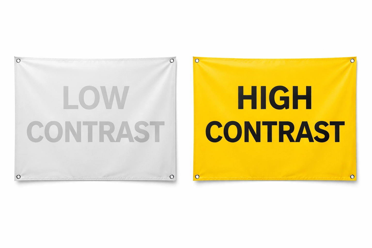
Reason 4: Your Color Scheme Lacks Contrast
The Problem: Research indicates up to 90 percent of first impressions are based on color. A brown scrim vinyl banner mounted on a brown building disappears. Low-contrast combinations: light gray on white, dark blue on black: fail to command attention.
The Fix: Use high-contrast color combinations. Black on yellow. White on red. Dark blue on bright orange. Consider the installation environment when selecting colors.
Your scrim banner competes with everything around it. Make it win.
Reason 5: Your Images Are Low Quality or Pixelated
The Problem: Images that appear sharp on a computer monitor become blurry and distorted when enlarged to banner scale. Pixelated logos and grainy photographs communicate unprofessionalism.
The Fix: Use high-resolution images. For print, images should measure at least 150 DPI at final print size. Vector logos scale without quality loss.
If original photos are unavailable, source quality stock images with proper licensing. Sharp images produce sharp impressions.
Reason 6: You Don't Have a Clear Focal Point
The Problem: Without a dominant visual element, viewer attention scatters. The eye has nowhere to land. The message gets lost in visual noise.
The Fix: Establish one focal point. Your business name. Your logo. Your primary offer. Position this element prominently: often near the top center of the scrim banner.
Use size and contrast to direct attention. Make the focal point impossible to miss.
Reason 7: You're Not Using White Space Effectively
The Problem: Filling every available inch with content creates visual clutter. Cramped designs feel chaotic and reduce overall impact.
The Fix: White space: negative space between design elements: creates breathing room. It emphasizes your focal point. It makes the entire scrim vinyl banner easier to process.
Empty space is not wasted space. It is strategic space.
Reason 8: Your Banner Material Isn't Suited to Its Environment
The Problem: Different banner materials perform differently under various conditions. A scrim banner in high-wind locations may sustain damage. The wrong material choice leads to premature wear and poor appearance.
The Fix: Match material to environment:
Scrim vinyl works well for most outdoor applications and offers affordability
Mesh banners allow wind to pass through, reducing stress in windy locations
Smooth vinyl provides cleaner results for indoor applications
For outdoor scrim banners, confirm waterproof construction, tear resistance, and UV-cured inks for color durability.
Reason 9: You're Not Accounting for Viewing Angle and Distance
The Problem: A design that looks balanced on screen may appear distorted from actual viewing positions. Banners mounted high on buildings present different viewing angles than banners at eye level.
The Fix: Determine the primary viewing distance and angle before designing. Account for height. Account for approach direction. Consider whether viewers approach from the left, right, or straight on.
Designs intended for ground-level viewing require different proportions than those mounted two stories up.
Reason 10: Your Banner Lacks a Clear, Concise Message
The Problem: Attempting to communicate multiple offers, services, and messages dilutes everything. The scrim banner says a lot. It communicates nothing.
The Fix: Use one short, simple message as your primary communication. Know your single purpose. Let that purpose drive every design decision.
Examples of effective banner messages:
"Grand Opening – Saturday"
"Now Hiring"
"50% Off This Weekend"
"Free Estimates – Call Now"
One message. Clear purpose. Measurable results.
Placement Tips for Maximum Visibility
Design alone does not guarantee results. Placement matters equally.
Height considerations: Mount your scrim vinyl banner where sightlines remain unobstructed. Too high reduces readability. Too low risks obstruction from vehicles, pedestrians, or other signage.
Lighting awareness: Consider how sunlight hits your banner throughout the day. Glare reduces visibility. Shadows obscure content.
Traffic patterns: Face your banner toward approaching traffic, not departing traffic. Position it where viewers have time to read before passing.
Permit requirements: Verify local signage regulations before installation. Some municipalities restrict banner sizes, placements, and durations.
Durability Factors for Outdoor Scrim Banners
A scrim banner that fades, tears, or deteriorates communicates neglect. Durability depends on:
Print quality: UV-cured inks resist fading from sun exposure
Material weight: Heavier scrim vinyl withstands wind and weather better
Hem and grommet quality: Reinforced edges and brass grommets prevent tearing at mounting points
Proper installation: Secure mounting reduces stress on banner material
Expect quality outdoor scrim banners to last 2-5 years with proper care and installation.
Getting Your Scrim Banner Right
A scrim vinyl banner represents your business to everyone who passes. It operates 24 hours a day. It requires no salary. It asks only for proper design and placement.
Fix these ten problems. Apply these principles. Your scrim banner starts working.
Need custom signage for your local business? Browse our products or visit Hard Re-Set Inc. for printing solutions with no minimums and fast turnaround.


Comments