
Postcards That Convert: Professional Design Tips & Premium Finishes
- Janet Emma
- Mar 8
- 4 min read

Design Strategy: Clarity and Conversion
Postcards fail when the message is cluttered. A converting postcard requires a singular focus. Do not include multiple offers. Select one primary objective.
1. Headline Selection
The headline must be the largest element. Use a bold, sans-serif font. Eliminate industry jargon. State the benefit immediately.
Direct: "50% Off Your First Detail."
Indirect: "We Provide Excellence in Automotive Care." (Avoid this).
2. Visual Hierarchy
Structure the layout to guide the eye. Use the following sequence:
Primary Headline
High-Resolution Image
Supporting Bullet Points
Clear Call to Action (CTA)
3. Typography Constraints
Limit the design to two font families. Use one for headlines and one for body text.
Headline Font: Heavy weight, high contrast.
Body Font: Standard weight, high legibility at 10pt size.
Contrast: Ensure text color contrasts sharply with the background. Do not use light gray text on white backgrounds.
Imagery and Resolution Standards
Do not use low-resolution images. All assets must be 300 DPI (Dots Per Inch) at the final print size. 72 DPI web images will appear pixelated and unprofessional.
Image Requirements
Format: CMYK (Cyan, Magenta, Yellow, Black). Do not use RGB.
Resolution: 300 DPI minimum.
Content: Relevant to the offer. Use professional photography of the actual product or service.
Technical Specifications: File Preparation
Failure to prepare files correctly results in production delays or poor print quality. Follow these exact specifications.
Bleed and Safety Margins
Full Bleed Size: Add 0.125 inches to all sides. (Example: A 4x6 postcard should have a file size of 4.25x6.25).
Safety Zone: Keep all critical text and logos 0.25 inches away from the trim edge.
Trim Line: This is where the card is cut. Expect a 1/16th inch variance.
Color Accuracy
Design in CMYK color mode. Colors viewed on a backlit monitor (RGB) will not perfectly match printed ink on paper. Black text should be "Flat Black" (C:0 M:0 Y:0 K:100). Large black backgrounds should be "Rich Black" (C:60 M:40 Y:40 K:100) for a deeper finish.
Premium Finishes: Impact and Durability
The physical feel of the postcard influences the recipient's perception of brand quality. Standard paper stock is insufficient for high-conversion campaigns.
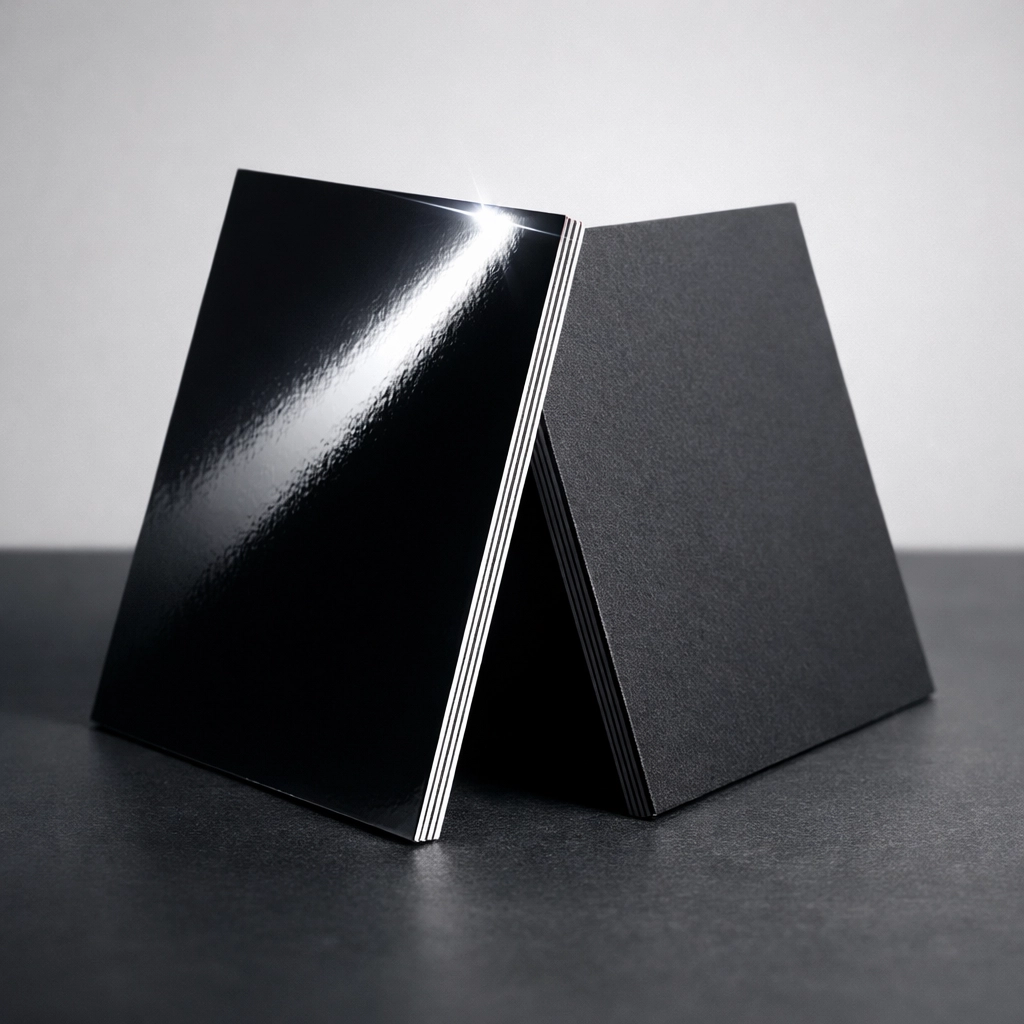
1. Gloss UV Coating
A high-gloss liquid coating applied to the surface and cured with ultraviolet light.
Effect: Maximum shine and color vibrancy.
Benefit: Provides a protective layer against scratches and moisture.
Usage: Best for high-impact visual marketing and photography-heavy designs.
2. Matte Finish
A smooth, non-reflective coating.
Effect: Subtle, professional, and elegant.
Benefit: Easier to read under direct light. Can be written on with a ballpoint pen.
Usage: Best for luxury brands or B2B communications.
3. Spot UV
The application of Gloss UV to specific areas of a Matte-finished card.
Effect: Creates a tactile and visual contrast.
Benefit: Highlights logos, headlines, or specific design elements.
Usage: Premium branding and high-end promotional materials.

4. Silk or Velvet Lamination
A heat-bonded plastic film applied to the card stock.
Effect: A soft, "peach-skin" texture.
Benefit: Highly durable and tear-resistant.
Usage: High-value lead generation where the card must be kept.
Call to Action (CTA) Optimization
A postcard without a clear instruction is a waste of capital. The CTA must be direct and unmistakable.
Direct Command Examples
"Call 555-0199 to Schedule."
"Bring This Card for 20% Off."
"Scan QR Code to Order."
"Visit www.hardre-setinc.com today."
Placement and Visibility
Place the CTA on both the front and the back. Use a high-contrast box or button-style graphic to draw the eye. Do not hide the contact information in small print.

Industry-Specific Applications
Postcards are effective across multiple sectors when the design matches the audience expectation.
Beauty and Wellness
Focus on high-quality portraits and clean layouts. Use Matte or Silk finishes to convey a sense of luxury and care.
Automotive and Trade Services
Use bold colors and high-contrast headlines. Emphasize reliability and specific offers. Gloss UV is recommended for durability in transit.
Food and Beverage
Use high-quality imagery of food products. Ensure the address and hours of operation are prominent.
Quality Over Bulk: The Small Business Advantage
Mass mailing low-quality flyers results in low conversion rates. Small businesses should focus on targeted, high-quality postcard runs.
Targeted Distribution
Identify specific demographics or geographic areas. Send 250 high-quality postcards with premium finishes rather than 2,500 low-quality black-and-white flyers.
The Value of Premium Stock
Use 14pt or 16pt card stock. Thin paper feels cheap and is often discarded immediately. Thicker stock commands attention and feels substantial in the hand.
Checklist for Postcard Success
Before submitting a file for print at Hard Re-Set Inc., verify the following:
Resolution: Is every image 300 DPI?
Color: Is the file in CMYK mode?
Bleed: Is there 0.125 inches of extra background on all sides?
Headline: Is the offer clear within 2 seconds of looking?
CTA: Is there a direct command to the reader?
Finish: Have you selected a finish (Gloss, Matte, Spot UV) that matches your brand?
Hard Re-Set Inc. Production Standards
We provide professional-grade printing with no unnecessary fluff. We prioritize quality for small businesses looking to convert leads into customers.
No Minimums: We support small runs for targeted campaigns.
Fast Turnaround: Production starts once files are verified.
Premium Options: Access to Gloss UV, Matte, and heavy card stocks.
Order Process Sequence
Prepare your design file according to the specs above.
Upload the file to the Hard Re-Set Inc. portal.
Select your quantity and premium finish.
Review the digital proof.
Approve for production.
Direct marketing requires precision. A postcard is a physical representation of your business. If the card looks cheap, the service is perceived as cheap. Invest in design and premium finishes to ensure your postcards convert.


Comments